


exploring the fabric of how we learn
new hobbies
Problem
Problem
Central Sewing is a loved and local shop in Edmonton, Alberta helping sewers do a little bit of everything: make a big equipment purchase, take a class, or top up on supplies.
But you wouldn't know it by visiting their site. Here's what users are saying about the current experience:
I'm confused
I wish there more description
Am I getting scammed?
The Challenge
How might we redesign Central Sewing's website experience and information architecture to highlight their value proposition?
Solution
Solution
The redesign encompassed three main changes to the profile page:
Redesigned information architecture to enhance discoverability
Emphasis on expertise to advise and fill knowledge gaps
Content design—adding additional information to support user purchase decisions
My Role
My Role
UX Designer and Researcher
Timeline
Timeline
3 Week Sprint
Design Team
Design Team
Myself (Solo Project)
Design Tools
Design Tools
Figma, Figjam, Pen and Paper
Approach
Research
Research
To start off, I conducted 8 user interviews, 4 usability tests on the current website, and 4 card sorts to investigate the motivations, challenges, and needs of Central Sewing's target customer base.
Ideate
Ideate
Synthesizing the data, I mapped out a revised sitemap based on the mental models and insights from card sorting and interviews. I then arranged card sort tiles on the revised sitemap to confirm and further define sub-categories and filters.
Design
Design
After mocking up sketches, I developed mid and high fidelity wireframes of a single task flow: purchase a sewing class. I chose this task flow based on the needs of my primary persona, while mapping out a product purchase task flow for future design iterations.
Research
Research Goals
Research Question 1 —> How, when, and why do sewers use large sewing equipment?
Research Question 2 —> How, when, and where do sewers acquire sewing supplies?
Research Question 3 —> How do sewers manage machine maintenance and repairs?
Research Question 4 —> How do sewers learn to sew?
User Interviews and Insights
I interviewed 8 people across different walks of life–new moms, great-grandmas, young professionals—and experience levels. Distinct insights emerged addressing each Research Question.
I can't find it
I can make it for less
Why I Sew
I sew because I can’t find what I’m looking for elsewhere
I sew because alternative services are too expensive or inconvenient
I sew because I enjoy the process
I sew because of the tangible reward/outcome
How I acquire supplies + equipment
I shop for fabric in person because it’s easier to evaluate texture, weight, and colour
For smaller purchases, accessibility + affordability is more important than quality
For larger purchases, I dig deeper into research and will save options to go back to after months of consideration
I value product recommendations from experts
in person
recommendations
concerned
what happens?
How I manage maintenance
I haven’t needed to do maintenance on my machine, yet
I sometimes worry about future machine maintenance
I grew up with machines that required maintenance, but it was hard to find a place to repair them when they broke down
How I learn(ed) to Sew
I want to take sewing lessons to advance my sewing skills
I prefer in class sewing instructions so I get live feedback when I’m doing something wrong
Limitations in my sewing knowledge stop me from sewing as often as I’d like
live feedback
knowledge gap
Competitive Analysis
From user interviews, clear trends in shopping habits and motivations began to emerge regarding Central Sewing and it's competitors addressing Research Question 2 —> Where do sewers shop for supplies?
Big Box Stores
(e.g. Walmart(
Big Box Craft Stores
(e.g. Fabricland, Michaels)
Big Box Online
(e.g. Amazon)
Local Sewing Stores
(e.g. Central Sewing)
Non-local Small Business
Thrift Stores
niche brands
time intensive
expensive shipping and returns
affordable and unique finds
cheaper prices
accessible
multi-purpose trips
wide range of options
accessible
not always reliable
time-intensive to assess options
expensive shipping
further away
tailored to sewing
friendly seervice
limited range of options
lower quality
Two personas emerged from these insights, primarily distinguished by experience levels and motivations.


Halle, the Hobby Sewer wants to start making her own apparel, just doesn’t know where to start when it comes to bridging her knowledge gap. Halle needs a better way to learn how to make a garment, because it’s hard to learn these skills by herself without guidance.
Elise, the Experienced Sewer needs a more efficient way to shop for sewing equipment and supplies, because her time is limited and in-store trips are time-consuming, so she can continue stitching memories even when there’s a lot going on.
Usability Testing—Central Sewing
I conducted 4 unmoderated usability tests to gather qualitative feedback around Central Sewing's current website experience, noting:
Experience finding a product to purchase
Experience finding a class of interest
Experience navigating through check-out
General impressions and reactions
Priority of Information
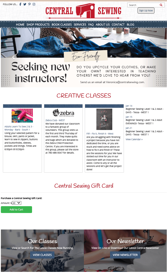
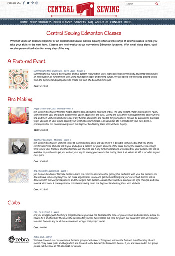
What do they sell?
Home
"The banner carousel feels like a big advertisement."
"I don't understand what they do, looking at the home page."
"I get the impression they sell more classes than products, based on the home page."
"The gift card call-to-action feels like it's hanging out in an odd place."
Navigation
"The search bar is really high on the page, and it took me a while to notice it."
"I noticed the navigation bar dissapears on some pages, and I don't know how to go back."
"I can’t read the links on the footer."
"I wish there was feedback when I hovered over links in the navigation bar."
Lack of Feedback
Low Discoverability
No Filtering?
Irrelevant Information
Class has passed?
Product and Class
Listing Pages
When I search for ‘sewing machines', I get a lot of unrelated options. What do I have to do to narrow down my search?
"The most highlighted information (instructor name, day of class) feels irrelevant until I understand the class content and if it is something I want to learn."
"It’s hard to visually distinguish between classes that have already happened and upcoming classes."
Product and Class
Description Pages
"I feel overwhelmed, I don’t know what to read first."
"If a class is closed, why is there still an ‘add to cart’ button?"
Even after reading the class description, I don't know what the difference between ‘Adult Learn to Sew’ and ‘Beginner Sewing’ is.
"I would like more info about the instructor. For example, projects they’ve done or taught in the past."
"I can’t tell if the class is in-person or online."
Overwhelmed
Confused
Untrustworthy
Irrelevant information
Checkout
"It would have been nice to know ahead of time that free in-store pickup is only for the South location, not after my basket is already full."
"Why are class terms and conditions popping up when I’m buying needles?"
"The layout feels funny. It feels sketchy, and I wouldn't be comfortable giving my credit card information."
Impressions
"I like the textured aesthetic - it gives me a feel for wha the website's about."
"The logo feels dated"
I like the tone
But it feels outdated
Card Sorting
—> Recurring Mental Models:
Sewing - Quilting - Embroidery
—> Sewing Machines vs. Sewing Accessories
—> Expansive sewing terms can be unfamiliar
Ideation
Navigation and Sitemapping


Design
Key design decisions and changes:
Clear, up-front value proposition: Make it clear what the store is and what they do - sewing equipment, sewing supplies, classes, maintenance - all in one go.
Less crowded nav bar: Smaller pages like 'Contact' 'Blog' and 'FAQ' are folded in. Search bar now becomes part of the main navigation
Introduction of Wishlist: As we saw from the C&C Analysis, Halle the Hobby Sewer is likely shopping around! Being able to save items to her wishlist allows her to return to products she liked, especially for big purchase decisions.
Chatbot for Support: Large sewing purchases, like sewing machines and classes, require extensive research and confidence before committing. There's a lot of sewing terminology or tools that Halle may be unfamiliar with. Via the chatbot, she can get help (a) finding what she's looking for, (b) being directed to FAQs, or (c) booking an appointment with the store to get tailored recommendations when shopping.
Reorganized Heirachy: Instead of having the newsletter CTA in the main banner, moved it to the footer. Now it's on every page and a visible CTA when users may be looking for specific information on the footer. This design decision deprioritizes actually linking to the newsletter, because the same information is accessible on the website.
Understanding the Value Prop
Finding the Right Class
Making a Decision
Reflection and Future Steps
Future Design Opportunities to Explore
Product User Journey
In future iterations, I plan to expand the design to showcase additional task flows, particularly around purchasing (a) large sewing equipment, and (b) recurring sewing supplies. While learning to sew was a primary pain-point that came up during interviews, the two task flows often go hand-in-hand. Sewing hobbyists like Halle need to purchase equipment and supplies to practice sewing. Distinct insights from user research will support future ideation and design.
Usability Testing for Refinement
I would also conduct additional usability tests on the redesigned website to identify areas of improvement and reprioritization of features.
See More Design Work


Comparative and Competitive Examination
Sed ut perspiciatis unde omnis iste natus error sit voluptatem. Ut enim ad minima veniam, quis nostrum exercitationem ullam corporis suscipit laboriosam. Neque porro quisquam est, qui dolorem ipsum quia dolor sit amet, consectetur, adipisci velit.
Ut enim ad minima veniam, quis nostrum exercitationem ullam corporis suscipit laboriosam.
Neque porro quisquam est, qui dolorem ipsum quia dolor sit amet, consectetur, adipisci velit.
Sed ut perspiciatis unde omnis iste natus error sit voluptatem.
Sed ut perspiciatis unde omnis iste natus error sit voluptatem. Ut enim ad minima veniam, quis nostrum exercitationem ullam corporis suscipit laboriosam.
Client: Marble Collective
Profile Page Redesign
Current Website
Redesigned Prototype
My Role
UX Designer and Researcher
Timeline
3 Week Sprint
Team Members
Ola Pater
Shamima Khan
Soojung Choi
Design Tools
Figma, Figjam, Pen and Paper
Problem
Sed ut perspiciatis unde omnis iste natus error sit voluptatem. Ut enim ad minima veniam, quis nostrum exercitationem ullam corporis suscipit laboriosam. Neque porro quisquam est, qui dolorem ipsum quia dolor sit amet, consectetur, adipisci velit.
Solution
Nam libero tempore, cum soluta nobis est eligendi optio cumque nihil impedit quo minus id quod maxime placeat. Nihil molestiae consequatur, vel illum qui dolorem eum. Architecto beatae vitae dicta sunt explicabo.